
Discovering Design Wisdom: Insights from a Visit to Rifle Paper Co.
- Apr 3, 2024
- 3 min read
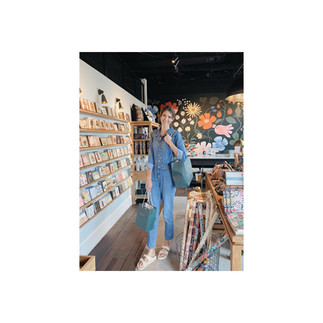
Stepping into the world of Rifle Paper Co. feels like entering a vibrant tapestry of colors and creativity. As a graphic designer, I embarked on a journey to glean insights from this renowned brand, and what I discovered went beyond just design principles. Here are the invaluable lessons I learned from my visit, which I'm thrilled to share with you.


Embrace the Spectrum: Don't Fear Color, But Embrace Consistency:
Rifle Paper Co. fearlessly embraces color, infusing every piece with a kaleidoscope of hues. From rich burgundies to soft pastels, their palette knows no bounds. However, amidst this riot of colors, lies a crucial lesson - consistency. While exploring their products, I noticed that despite the vibrant spectrum, each design retained a recognizable color scheme. This harmony in diversity is a testament to the power of consistent branding. As designers, we shouldn't shy away from bold colors, but rather ensure they align with our brand identity, creating a cohesive visual experience.
Presentation Matters: Showcase Your Artwork in its Best Light:
One of the striking aspects of Rifle Paper Co.'s store was the impeccable presentation of their artwork. Every piece was meticulously displayed, evoking a sense of awe and admiration. This emphasizes the importance of presentation in design. Whether it's an online portfolio or a physical exhibit, how we showcase our work significantly impacts its reception. Investing time and effort into presentation not only elevates the aesthetic appeal but also communicates professionalism and attention to detail.
Art as an Experience: Creating and Conjuring Memories:
Walking through Rifle Paper Co.'s gallery-like space, I realized that art transcends mere visuals; it's an experience. Each illustration, each product, had a story to tell - invoking nostalgia, sparking joy, and igniting imagination. This insight underscores the profound impact art can have on emotions and memories. As designers, our goal should not be limited to aesthetics alone but to craft experiences that resonate with people on a deeper level, forging connections and leaving lasting impressions.
Beyond Screens: Think Outside the Box in Art Presentation:
In the digital age, it's easy to confine art to screens, but Rifle Paper Co. challenges this notion. Their designs adorn not just prints and cards but also a myriad of everyday products - from notebooks to kitchenware. This unconventional approach highlights the versatility of art and the importance of thinking outside the box in its presentation. By integrating art into tangible objects, we enhance its accessibility and impact, enriching the lives of people beyond the digital realm.
Embrace Your Niche and Style: Cater to Your Target Audience's Expectations:
Rifle Paper Co.'s distinct style and niche have garnered a devoted following. Their signature floral motifs and whimsical illustrations have become instantly recognizable, catering to a specific audience who appreciates their aesthetic. This reaffirms the significance of finding your niche and owning your style as a designer. By staying true to your artistic vision, you not only attract like-minded individuals but also cultivate a loyal clientele who knows what to expect and eagerly awaits your creations.
Visiting Rifle Paper Co. was more than just a design excursion; it was a journey of enlightenment. From the vibrant colors to the meticulous presentation, each aspect offered valuable insights into the art of graphic design. As we embark on our own creative endeavors, let's heed these lessons, embracing color fearlessly, presenting our work impeccably, crafting memorable experiences, thinking innovatively, and staying true to our unique style. In doing so, we honor the legacy of Rifle Paper Co. while forging our own path in the world of design.


The custom fonts option from TypeType feels accessible even if you are not part of a big company. It does not sound intimidating or overly complex. From a user perspective this is encouraging because it opens the idea of having something unique without losing practicality. I like custom font and the thought that the result will still be usable in real life scenarios like websites and apps not just branding presentations.